Have you ever heard of the monk-approved aesthetic? Coined by Ellis Tree and Liz Gorny from It’s Nice That, it’s where ultra-crisp, gilded logos with high-contrast serifs looked like they were chiseled into the side of a marble library. They felt permanent, expensive, and honestly, a bit rigid. Now, the shift seems to be getting messier, a lot softer, and so much more exciting.
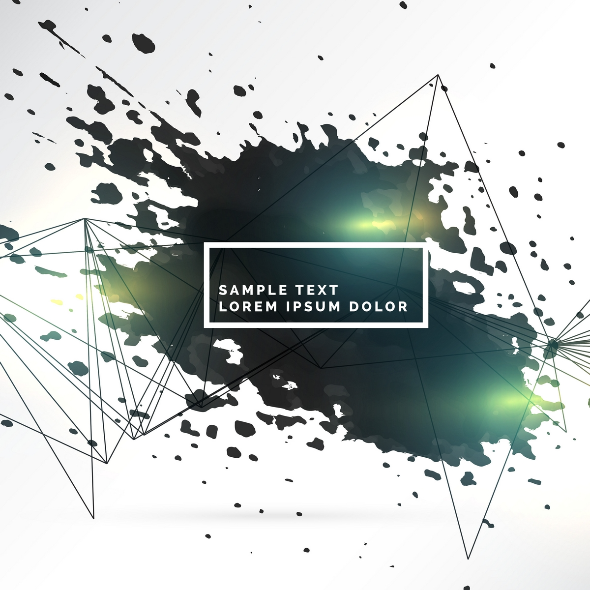
Right now, we’re witnessing the rise of the Blotch. It’s a trend that’s making brand identities look less like corporate stamps and more like something that’s leaking, melting, or being poured onto a digital canvas. If you’ve looked at the wordmark for Skims lately, you’ve seen the blueprint.
So, what is this slightly melted, fluid-like thing, and how are unlimited graphic design services finally catching up to that soft-touch reality? Let’s find out!
From Precision to Naive Volatility
There’s something almost rebellious about this new wave of design. For decades, the goal of a logo was legibility and geometric precision. If a line was a fraction of a millimeter off, it was a disaster. Now? Designers are leaning into what could be called blurry, naive forms.
Take the identity for the Swiss Art Awards from last year. They essentially turned blotches of type into forms that look more like abstract paintings than traditional letters. It’s volatile and a bit risky as well. You’re sacrificing that immediate at-a-glance reading for something that feels much more emotive and raw.
It feels like someone drew it with a marker that was starting to leak on the page. This work by Clio Hadjigeorgiou and Clemens Piontek feels refreshingly human in an era where everything is so hyper-processed.
The Shape-Shifter Utility
We know what you’re thinking—why would a brand want a logo that looks like it’s spilling out in all directions? A seasoned graphic design subscription service in Santa Clara, like Copa Design, can confirm it’s not about being edgy.
There’s a very practical, digital-first reason for this fluidity. We’re living in an age where motion touches every single corner of a brand’s expression. A logo isn’t just a sticker on a box anymore, but an icon that bounces, a loading screen that swells, and an Instagram story that shrinks.
These blotchy forms are already on the move, and they feel alive. The Other wine brand has a logo that looks fluid enough to be poured right out of the bottle. Then, there’s Mud, a dog-wash brand that embraced the literal messiness of its product.
Another notable example of this utility has to be Chantelle Pulp. They use a variable logotype where the letters actually stretch out. It’s a brilliant bit of visual storytelling where the logo itself “celebrates all shapes and sizes” by physically expanding and contracting! It’s a literal manifestation of the brand’s values, something a rigid, static logo could never achieve.
Softness with a Purpose
It’s important to note that blotchy doesn’t have to mean careless. No branding and graphic design service in Santa Clara, can sacrifice functionality for aesthetics. Some of these identities are quite specific with their melting points. Take Caramba Agency’s recent work for Wolke, where the base of the logo is the only part that starts to liquefy. This gives the brand a sense of gravity, or a lack thereof.
Then you have work like the 2025 International Poster Competition. Their identity didn’t prioritize legibility at all, which is a bold move for a poster contest. Instead, it focused on a vibe that felt “distinctly electronic.” It’s a reminder that in the modern world, a logo’s job is often more about setting a mood than providing a directory-style read.
What’s Next
Most unlimited graphic design services in Santa Clara will agree that we’re going to see a lot more of these organic, variable forms in 2026. As our interactions with brands become more screen-based and interactive, the need for shape-shifter logos is only going to grow.
There’s a certain warmth in the “melt.” It removes that cold, corporate barrier and replaces it with something that feels tactile and responsive. It suggests that the brand is adaptable, that it can move with us, and that it isn’t afraid to make a bit of a mess.
Maybe a little bit of a blotch is exactly what we need in a world that can often feel a bit too polished and artificial. Maybe we all need to feel something real again. Whatever it is, it’s a move away from the rigidity and toward something that actually has a pulse!
FAQs
- Does a “blotchy” or “melting” logo make a brand look unprofessional?
Blotchy or melting logos aren’t unprofessional. They appear authentic, human, and adaptable.
- Won’t a blurry or volatile logo be difficult for customers to recognize?
Logos stick in our heads through their form, not just letters. Take the distortion of the Skims logo. Its shape and curve are now so well-known to us that another brand using typography close to theirs would alert us.
- Would graphic design services be willing to do this kind of work?
That depends. But many talented full-service creative agencies in Santa Clara are up for this trend.


Leave a Reply