
Choosing the right color for Colorbond cladding is a crucial decision that can significantly impact your home’s aesthetic and value. With a wide array of colors available, it’s essential to consider various factors, from your environment to personal preferences. This guide will help you navigate the selection process to ensure you make a choice that complements your home beautifully and lasts for years to come.
Understanding the Importance of Color in Your Cladding Choice
The color of your cladding not only enhances your home’s visual appeal but also reflects your personal style. It can influence how your home is perceived in the neighborhood and contribute to its overall curb appeal. Choosing the right color can enhance architectural features and create a cohesive look.
Consider Your Surroundings
Analyzing the Environment: How Nature Influences Color Choices
When selecting a color for Claddco Colorbond cladding, consider the surrounding environment. The landscape, flora, and existing structures can guide your choice. For instance:
- Natural Elements: Earthy tones may complement a bushland setting.
- Urban Settings: Bold colors can make a statement in a cityscape.
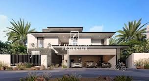
Architectural Styles: Matching Colorbond Colors to Your Home’s Design
Your home’s architectural style should also influence your color selection. Here are some considerations:
- Traditional Homes: Classic colors like greens and creams work well.
- Modern Designs: Bright and bold colors can enhance contemporary styles.
Assessing Personal Style
Reflecting Your Personality: Choosing Colors that Suit Your Taste
Your home is an extension of your personality. Selecting a color that resonates with your style is important. Consider:
- Favorite Colors: Incorporate shades you love.
- Consistency: Ensure the color aligns with the overall aesthetic of your home.
Trends vs. Timeless: Balancing Current Trends with Classic Choices
While it’s tempting to choose trendy colors, timeless options often provide greater longevity. Consider:
- Current Trends: Popular colors can enhance your home’s appeal.
- Classic Choices: Neutral and classic colors often retain their value over time.
The Role of Light
How Natural Light Affects Color Perception
The way light interacts with color can drastically change its appearance. Factors include:
- Orientation: North-facing walls receive more light, affecting color brightness.
- Time of Day: Colors may appear different at various times of day.
Testing Colors: Viewing Samples in Different Lighting Conditions
Before making a final decision, view color samples in various lighting conditions. This will help you:
- Visualize the Final Look: See how the color appears throughout the day.
- Make Adjustments: Decide if a different shade is needed.
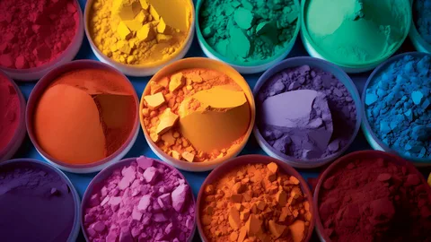
Color Psychology
The Impact of Colors on Mood and Emotion
Colors can evoke emotions and influence mood. For example:
- Blues and Greens: Often associated with calm and tranquility.
- Reds and Yellows: Can create energy and warmth.
Creating Atmosphere: Using Color to Set the Right Tone
Consider how you want your home to feel:
- Warm and Inviting: Opt for warm tones.
- Cool and Modern: Choose cooler shades for a contemporary vibe.
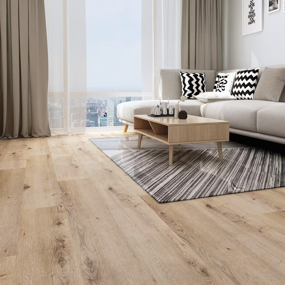
Durability and Maintenance
Choosing Colors that Resist Fading and Wear
Not all colors perform equally when exposed to the elements. Select shades known for their durability, including:
- UV Resistance: Ensure colors maintain their vibrancy over time.
- Fade Resistance: Darker colors may show fading less than lighter shades.
Maintenance Considerations: Lighter vs. Darker Colors
Consider the maintenance requirements for different colors:
- Lighter Colors: May require more frequent cleaning.
- Darker Colors: Tend to hide dirt but may show scratches more easily.
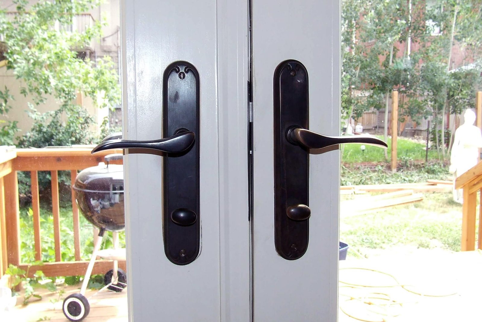
Aesthetics and Contrast
Using Contrast to Highlight Architectural Features
Creating contrast can enhance your home’s unique features. Consider:
- Trim Colors: Use contrasting colors for windows and doors.
- Roof Color: Ensure your cladding color complements your roof.
Complementing Other Elements: Finding Harmony with Windows and Roofs
Achieving harmony between cladding and other architectural elements is essential:
- Window Frames: Match or contrast with your Colorbond color.
- Roofing Materials: Ensure compatibility with your chosen cladding.
Practical Tips for Selection
Creating a Color Palette: Combining Colorbond with Other Materials
Consider how Colorbond cladding interacts with other materials:
- Textures: Combine different materials for depth.
- Color Harmony: Ensure colors work together for a cohesive look.
Seeking Professional Advice: When to Consult an Expert
If you’re unsure about your choice, consulting a professional can provide valuable insights. They can:
- Offer Guidance: Help you navigate color options.
- Provide Samples: Offer physical samples for better visualization.
Conclusion
Recap of Key Considerations in Choosing Your Colorbond Color
Choosing the right color for your Colorbond cladding involves considering your surroundings, personal style, and the interplay of light. A thoughtful approach will result in a beautiful, cohesive look that stands the test of time.
Encouragement to Explore the Colorbond Range
Take the time to explore the vast range of Colorbond colors available. Each option brings unique benefits and aesthetic possibilities.
Discover the full range of Colorbond colors at Claddco! Our experts are ready to assist you in selecting the perfect shade for your cladding project. Reach out today to start your journey toward a stunning exterior!


Leave a Reply