According to a recent study, 80% of businesses reported increased revenue using data analytics. Its immense benefits are why businesses leverage data to make better business decisions and why you should join them as well.
However, raw data is difficult to understand and adds little value in itself. Data becomes a real asset after it is refined and analyzed to gather valuable insights. Data visualization is the final step in that process, which visually presents data for individuals to understand and analyze all that information.
In this article, we will explore how qualitative data visualization services can make data work for your business to help you make better and more informed decisions.
What is Data Visualization?
Data visualization is part of the data analytics process. It is one of the last stages in which insights from data are presented in a way that is easy to understand and interpret.
Data visualization services are used to convert complex data sets into visual formats such as charts, graphs, maps, or infographics. This pictorial representation of data helps professionals quickly identify patterns, trends, and insights to make data-based decisions for business growth.
Why is Data Visualization Important?
Data visualization helps business heads understand the intricacies of business operations. It simplifies complex data and reveals patterns and trends—allowing stakeholders to make decisions backed by data.
Types of Data Visualization
Data visualization services employ various types and tools to communicate the information to decision makers. Each of these types has its strengths under suitable conditions. Understanding these data visualization categories is vital for effective analysis of raw data.
These are some of the main types of data visualization:
- Bar Charts display rectangular bars with lengths proportional to the values they represent.
- Line Charts connect data points with a continuous line to represent upward or downward trends across intervals.
- Pie Charts divide a circle into portions, each representing a proportion out of the total.
- Heat Maps use color gradients to show data density of intensity levels.
- Scatter Plots show the relationship between two numerical variables. Each point represents a data observation based on two variables.
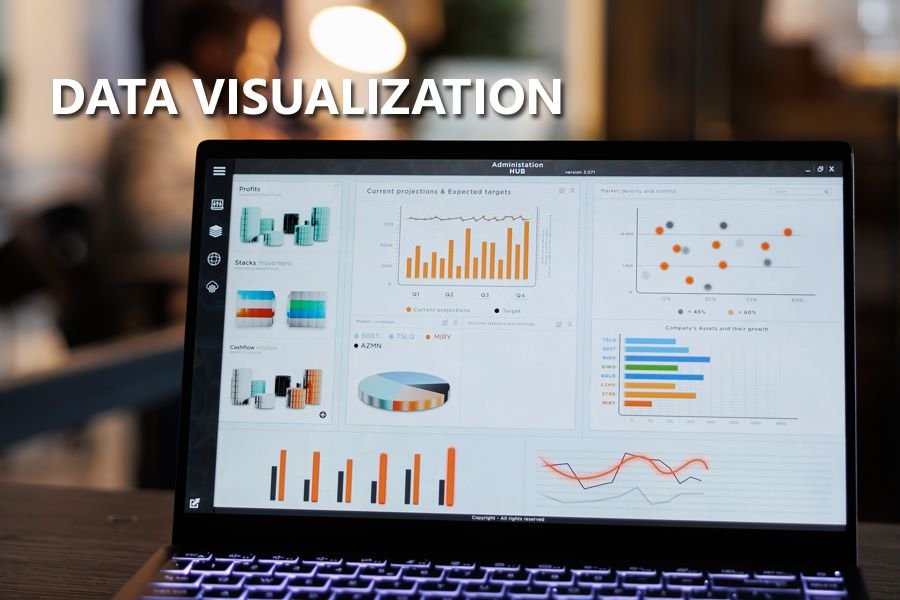
- Dashboard collects different visuals to give an overview of key metrics in one place. It allows data to be monitored in real-time and look for more details.
How to Leverage Data Visualization Services for Improved Decision-Making
Many businesses struggle to make data work for them. The effective use of data visualization services depends upon different factors. Here is a detailed guide to help you make the best out of your business through data visualization:
Identify Clear Objectives
Define a roadmap for your goals and understand what questions you want the data to answer. Tailor data complexity according to your audience’s needs, whether they want just summaries or more details.
This way, you can keep visualizations focused and relevant to the objectives.
Select Appropriate Type
Choose the visualization type that is relevant to your needs. It is critical to select the right type of visualization based on the data type and what kind of insights are wanted.
Here is the best use-case scenario for different types:
- Use pie charts to show the relative size of parts within a whole. For example, if you want to show the market share that your business currently holds compared to that of your competitors.
- Bar charts are helpful for comparing quantities across categories. They represent indicators such as sales figures by product or customers by region.
- Line charts are ideal if you want to show trends or changes over time. They can track things like monthly sales or stock prices over time.
- Heat maps are great for mapping activity levels in a geographical area. For example, you can monitor website traffic or customer activity from particular regions.
- Use scatter plots if you want a visual representation of correlations between different business factors. For example, scatter plots can graph how much money is being spent on marketing compared to the sales revenue it is generating.
- Dashboards are useful for business intelligence. Use them to combine multiple types of visual aids to access a cohesive view of performance.
Create a Data Story
After you have collected and organized the relevant data sets, you need to build your visualization around a storyline. Much like storytelling, you need to guide viewers through the data intuitively and logically.
For this purpose, highlight key insights, user color combinations, annotations, and design features to emphasize significant points or trends.
Make Your Visualizations Interactive
Data visualization services focus on interactivity to increase user engagement. They allow participants to engage with data to gain personalized insights.
You can use platforms like Tableau and Power BI to explore data interactively by filtering and probing into details.
Monitor and Refine Your Visuals
Get feedback from users to evaluate how your visualizations impact decision-making.
Data visualization trends keep evolving. Continuously update and refine your visualizations, and tweak them with colors, layouts, and types based on changing conditions.
Conclusion
Mastering data visualization services is instrumental in making informed and data-driven decisions. With proper tools and techniques, businesses can transform data into visuals that provide valuable insights for impactful decisions.


Leave a Reply